Team
Senior Designer -(Kyle)
Engineer - (Dinakar)
Focus
Design thinking,Wire framing,Prototyping, Problem-solving
Overview
Community Health Workers (CHWs) often meet with clients under intense time pressure — just 40 minutes per appointment to assess needs, build trust, and connect people with vital services. Yet much of that time is wasted digging through outdated paper binders or static PDFs to locate resources like housing, food, or healthcare.
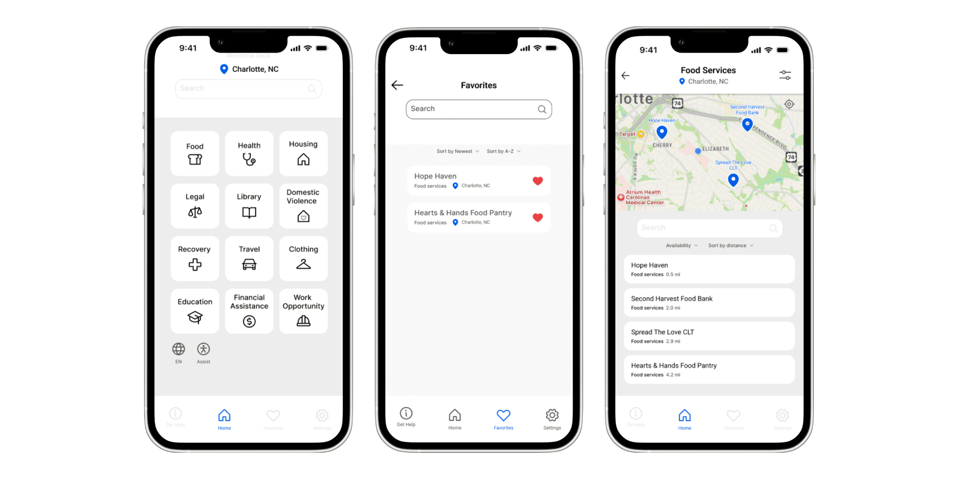
As the sole Product Designer on this self-initiated project, I set out to design a mobile solution that streamlined this process. My goal: help CHWs spend less time searching and more time with clients. Over several months, I led research, ideation, prototyping, and usability testing to create a high-fidelity prototype validated by real CHWs.
Problem
Through early conversations, I learned that finding up-to-date community resources was frustrating and inefficient. A typical workflow looked like this:
10–15 minutes of flipping through printed directories or PDF spreadsheets.
Uncertainty over whether information was still accurate.
Lost opportunities to engage clients in meaningful conversation.
I framed my design challenge as:
How might we give CHWs a fast, reliable way to find resources during appointments, so they can maximize their limited time with clients?
Getting Involved
When I joined the project, the user research had already been conducted a few months prior by our senior researcher. I used those insights to get up to speed on the issues of -
To better understand the context, I worked closely with the design team during design sprints, asking questions and digging deeper into how we could reimagine the check-in process while keeping user trust in mind.
We learned that while users wanted to feel safe and informed, many were hesitant to share their location with their employer. Even with our updated concepts and user-validated designs, the business required that the check-in functionality stay the same due to technical limitations and the tight deadline.
This pushed us to focus on how we could improve the user flow of the app:
clarity, transparency, and how we visually guided users through the experience.
Solution / Approach
Initially, we explored a dynamic map experience inspired by Apple Maps’ Guides feature. However, during stakeholder review, concerns arose around technical complexity with API integration. This technical limitation led to use having to remove the map from the MVP.
Although the map was cut, this feedback taught me how to pivot without losing the design’s purpose of providing users with clarity and confidence. I redesigned the flow to focus on clear menus and localized guidance, preserving the sense of awareness without location tracking.
mid-fi exploration of the design without the map
Our redesign shifted the focus from how location data was being tracked to transparency. By clarifying when and why location access was used, and adding proactive guidance features, users reported feeling more in control.
We presented the designs to our business stakeholders and received a few key pieces of feedback:
The map functionality that was a main component of the app would be removed.😱
In our designs, we explored what the check-in process would look like instead, allowing users to view different locations outside of their own, which would help them better plan and prepare for traveling when working.
Reflection / What I’d Do Differently
If I could approach this project again, I’d spend more time upfront understanding the technical limitations of the security team’s system and how they actually track employee safety. We didn’t uncover those details until later in the process, and by then, our designs were already at mid-to-high fidelity, which led to an additional round of revisions.
I’d also collaborate more closely with engineering on spec handoffs to ensure smoother implementation. Some small bugs surfaced after launch that our team helped address through design support.
This being the first time I’ve led an end-to-end product design project at Apple, it taught me how real-world constraints could shape design decisions. It made me think deeper about the pain points users face in critical tools like this and the real business cost of low adoption—how thoughtful UX can bridge that gap between safety, usability, and trust.
RELATED WORK
Case Study: Designing Consistency for Spatial Computing →


